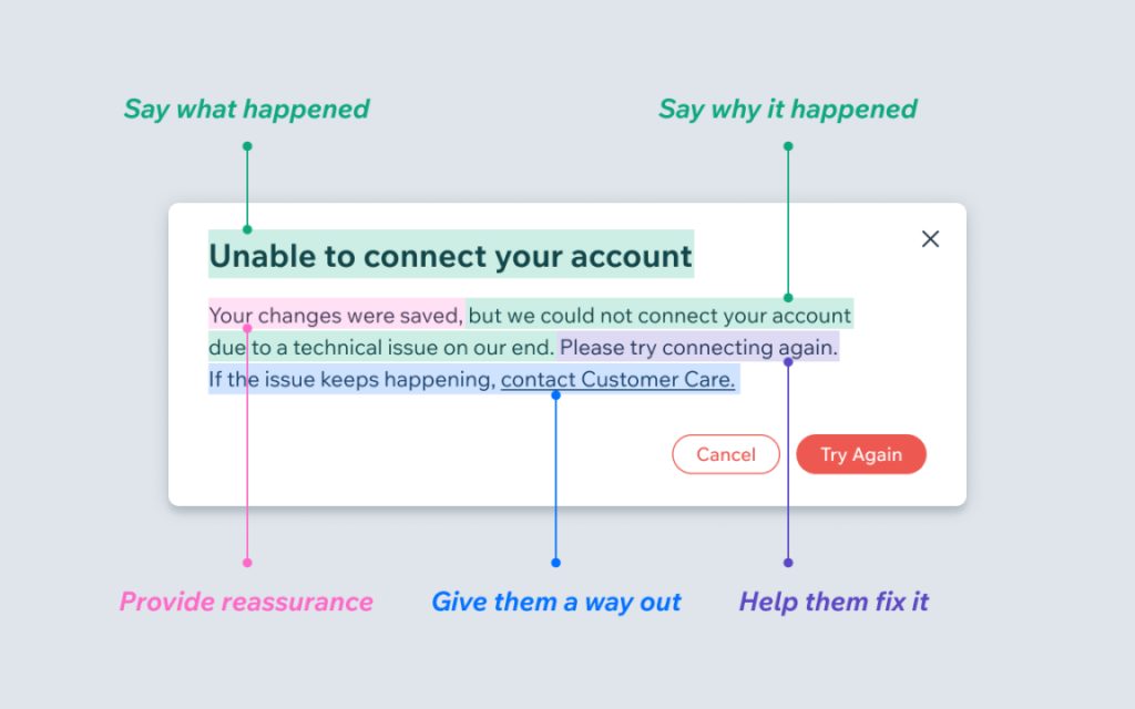
Vitaly Friedman posted a great article on LinkedIn about designing effective error messages. It’s a great resource for anyone in the UI/UX space, and I highly recommend it.
He says, “When we design interfaces, we rarely think about error messages first. But a strategic and thorough design of these messages can be critical for businesses — especially if they struggle with high abandonment. Error messages can make or break the experience in situations when things go south.”
It’s true; how many times have you left a site, app, user interface of any kind due to vague, unclear or frustrating error messages?
Tips for error message design
He provides rules for error message user interfaces that are spot on:
- Never Rely On Color Alone
- Never Cover User’s Input
- In Forms, Display Error Messages Above Input
- In Tables, Display Error Messages Inline
- Don’t Rely on Toast Error Messages (“… animated notifications, informing users about change of status of the system with floating messages.”)
- Allow Users to Override Error Messages
The article, Designing Better Error Messages UX, is excellent.
Leave a Reply