-

Helpful tips for good design
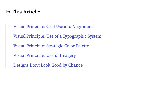
Nielsen Norman Group has posted an article with tips for good design that’s worth a read. It details how to create appealing designs and provides helpful advice such as: Read Good Visual Design, Explained
-
The 10 Usability Heuristics in Cartoons: Jakob Nielsen
Jakob Nielsen’s 10 Usability Heuristics are fundamental principles for designing user-friendly interfaces. I use them often to evaluate my work – and other websites and applications I encounter. They serve as general guidelines rather than strict rules, and at times are open to interpretation, but they help UX designers create intuitive, efficient, and hopefully satisfying…
-

Book: Digital Icons That Work: A Comprehensive Guide to Enhancing User Experience with Effective Iconography
Icons are essential to my work as a Service and UX Designer (and the work of others around me), but they also misused, misunderstood and controversial. One person’s decisions usually dictate how icons are chosen, and used, in many projects. A subjective (and potentially inaccurate) approach can make interfaces cluttered and harder to use —…
-

The Usability of Touchscreens in Modern Vehicles: A Growing Concern
Car safety experts and drivers have long been concerned about the usability of touchscreens in vehicles. If you have tried to use one while driving, you know why. Many people prefer the simplicity of traditional buttons. Over the past 30-plus years, digital displays have replaced tactile knobs and buttons, leading to concerns about increased distracted…
-

10 years of Google Material Design
Google Material, also known as Material Design, is a design system developed by Google in 2014. It was Google’s comprehensive design system/framework to create good UX and UI designs. It aims to create a unified, consistent user experience across various devices, platforms, and screen sizes. It’s 10 years old and has evolved a lot in…
-

Web forms placeholder text – Don’t use it!
I found a great resource that explains with excellent examples why we shouldn’t use web forms placeholder text as field labels. “Placeholders are popular because they save space and have a minimalist aesthetic. But using placeholder text for labels or even just hint text is problematic.” I often explain to people that what is most…
-

Designing for neurodivergence: Software accessibility and ADHD
Digital accessibility is important for many reasons and its importance is only growing. Yet defining what accessibility means, or what the application of universal accessibility principles look like when designing for neurodivergence, is really challenging. I believe that many people use WCAG compliance checkers to test their work for technical compliance. That’s a good start,…
-

Designing Progress Trackers
I’m working on a progress tracker for a service within a larger application environment and am looking at ways to incorporate this component into the existing pattern. I want to design a progress tracker that both looks good and also enhances the user experience by making a specific process clear. Here are key factors I’m…
-

Don’t break the rules… Checkboxes Are Square; Radio Buttons Are Round
Hey you (Apple included)! Don’t break established design principles! This public service announcement comes from Jakob Nielsen in a recent UX Roundup newsletter. He essentially says that square pegs and round holes don’t mix: Why you shouldn’t change design principles It is important to follow established UI principles to ensure usability, consistency, and intuitive interaction…
-
Figma course – Introduction to design systems
A colleague forwarded me this link to a free Figma course, which I am saving for future reference. It’s a course that’s all about design systems. It’s also apparently for both beginners and experts, so there should be something for everyone! Course description from Figma: “Design systems are a vast and ever-evolving concept, it can…