-

The Usability of Touchscreens in Modern Vehicles: A Growing Concern
Car safety experts and drivers have long been concerned about the usability of touchscreens in vehicles. If you have tried to use one while driving, you know why. Many people prefer the simplicity of traditional buttons. Over the past 30-plus years, digital displays have replaced tactile knobs and buttons, leading to concerns about increased distracted…
-

Web forms placeholder text – Don’t use it!
I found a great resource that explains with excellent examples why we shouldn’t use web forms placeholder text as field labels. “Placeholders are popular because they save space and have a minimalist aesthetic. But using placeholder text for labels or even just hint text is problematic.” I often explain to people that what is most…
-

Designing for neurodivergence: Software accessibility and ADHD
Digital accessibility is important for many reasons and its importance is only growing. Yet defining what accessibility means, or what the application of universal accessibility principles look like when designing for neurodivergence, is really challenging. I believe that many people use WCAG compliance checkers to test their work for technical compliance. That’s a good start,…
-

Accessibility resource: The A11Y Project
The A11Y Project is a community-driven effort to make digital accessibility easier. It’s full of resources, information and context for people in different roles to help them create more accessible digital products and experiences. Summary of the The A11Y Project: Visit the A11y Project for more
-
How to create accessible web products by Digital BC
If you are looking for a resource that articulates the importance of creaing accessible web products to both experienced professionals and those new to digital accesibility, Digital BC has a great resource for you. This accessibility information is part of the Digital BC website from the Government of British Columbia. It provides information and guidance…
-

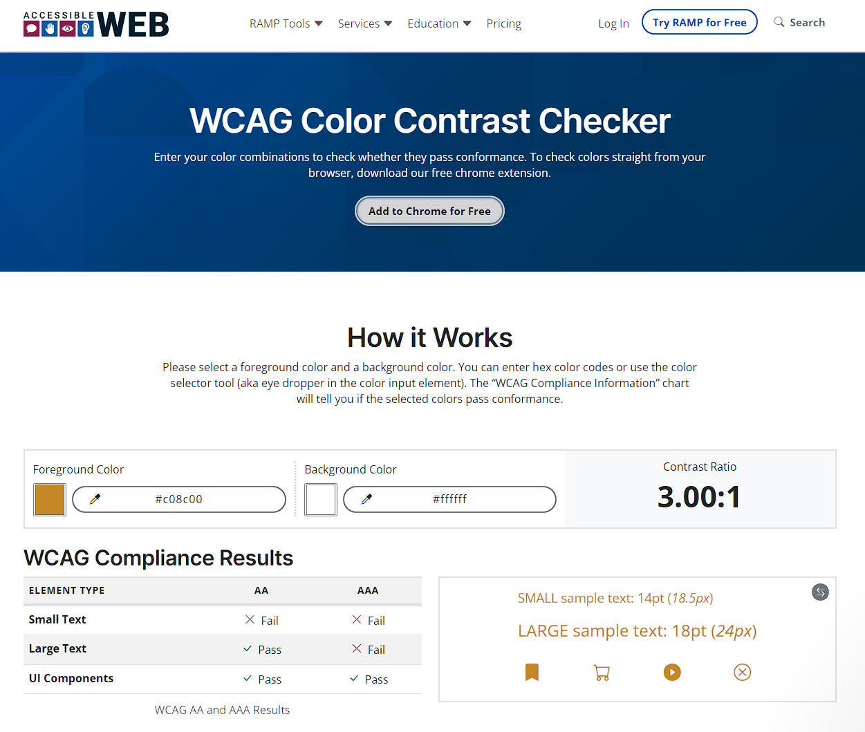
WCAG Color Contrast Checker
Use this WCAG Color Contrast Checker to check your colour choices to make sure they pass WCAG accessibility standards. To check colors straight from your browser, download the free chrome extension. It allows you to check font and icon colour contrast, and verifies AA and AAA compliance! View the WCAG Color Contrast Checker
-
Error message interfaces that work for users
Vitaly Friedman posted a great article on LinkedIn about designing effective error messages. It’s a great resource for anyone in the UI/UX space, and I highly recommend it. He says, “When we design interfaces, we rarely think about error messages first. But a strategic and thorough design of these messages can be critical for businesses…
-
Creating accessible digital content
Digital BC has excellent accessibility resources for content creators/designers to help them create accessible digital content, specifically writing, content design consideration, how to link/embed media and more:
-

Digital BC – Digital Service Topics
Digital British Columbia has a website full of useful resources for anyone creating digital services. If you work in government, it’s particularly helpful and contains good information around: They also have information around:
-

New WCAG 2.2 Accessibility Guidelines: What It Means For You
WCAG 2.2 is the next version of WCAG, published in October 2023. It has 6 new Level A+AA success criteria, and 3 new Level AAA criteria. Learn more via LinkedIn Post