Icons are essential to my work as a Service and UX Designer (and the work of others around me), but they also misused, misunderstood and controversial.
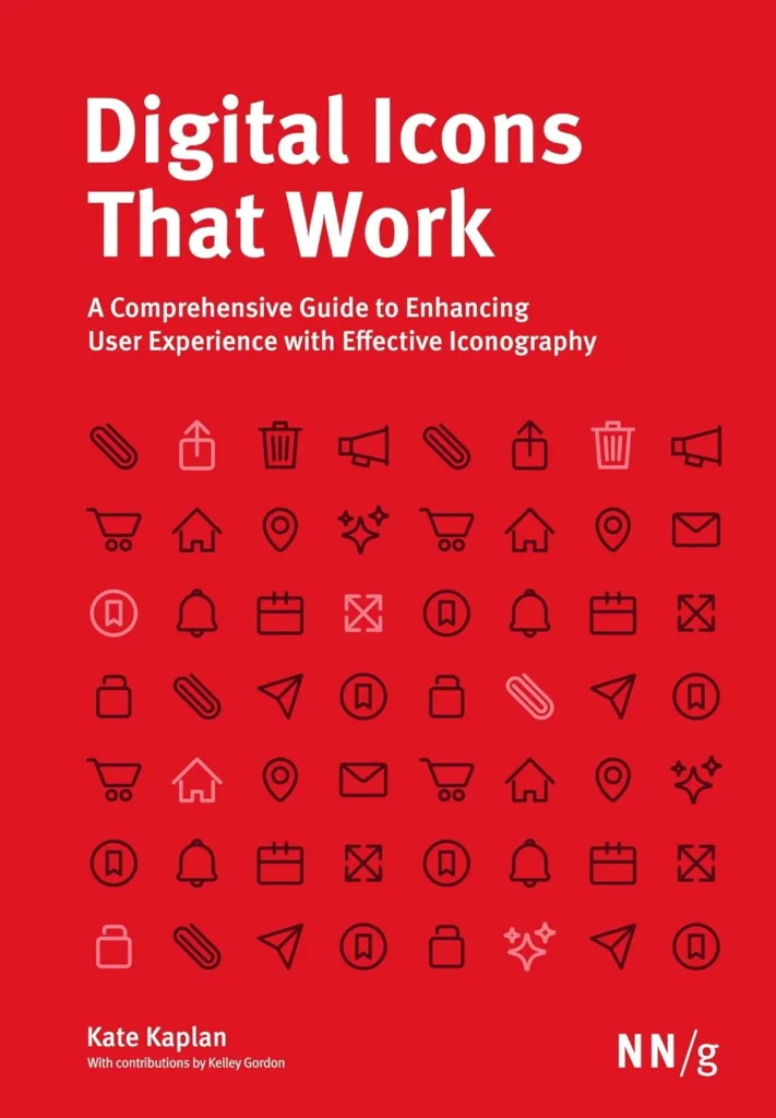
One person’s decisions usually dictate how icons are chosen, and used, in many projects. A subjective (and potentially inaccurate) approach can make interfaces cluttered and harder to use — and devalue the work or goals of the project. As the introduction states, “… icons are not frivolous.”
What I learned in this book
This book provides specific findings around icon types, usage, user perceptiond and standardized associations, including:
- Giving the UX designer (or anyone involved in digital products) the background around icons for common application functions. This was particularly interesting as while I have been practicing design for many years, I have never (and would never) have the time to do a study like this to make my use of icons more methodical and intentional.
- Providing key information around icon design that gives insight on the principles important to icon design.
- Articulating some of the best information I have read about testing the effectiveness of icons in designs; even the explanation of methodologies used has given me ideas about ways I can study icons used in my designs, in small ways, to give me a higher level of assurance that my designs “work” for users.
You can use it as soon as you open it
It took me a while to read this book in part because I kept using it as a reference. I’d seek recommendations around using icons for common functions in my work, rather than sit down and read it cover to cover. It was so immediately useful that it became my go-to reference to understand “what the research says.” It helped me complete work faster and with confidence that I was using a good and informed approach.
In my experience, I have found NN/g’s reports and publications to be the best in the industry. This book is no exception and has provided me tremendous value and insights. I encourage you to check it out!
Leave a Reply